 Menu
Menu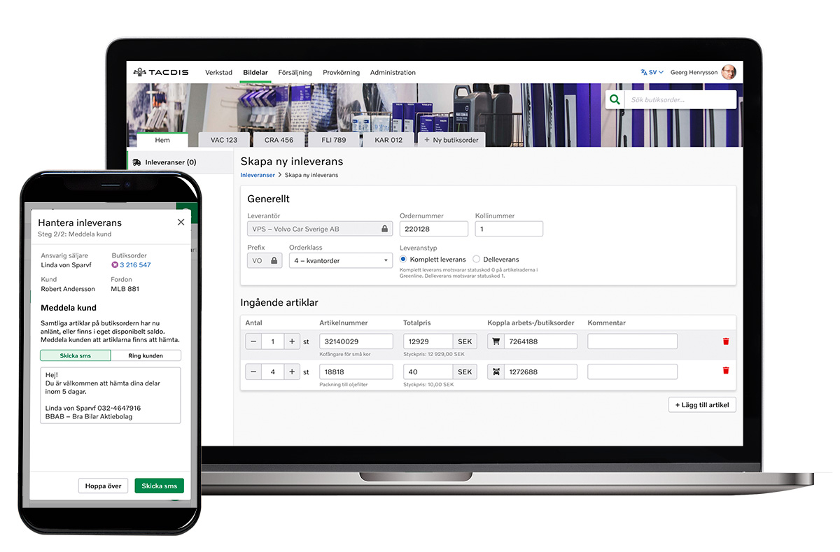
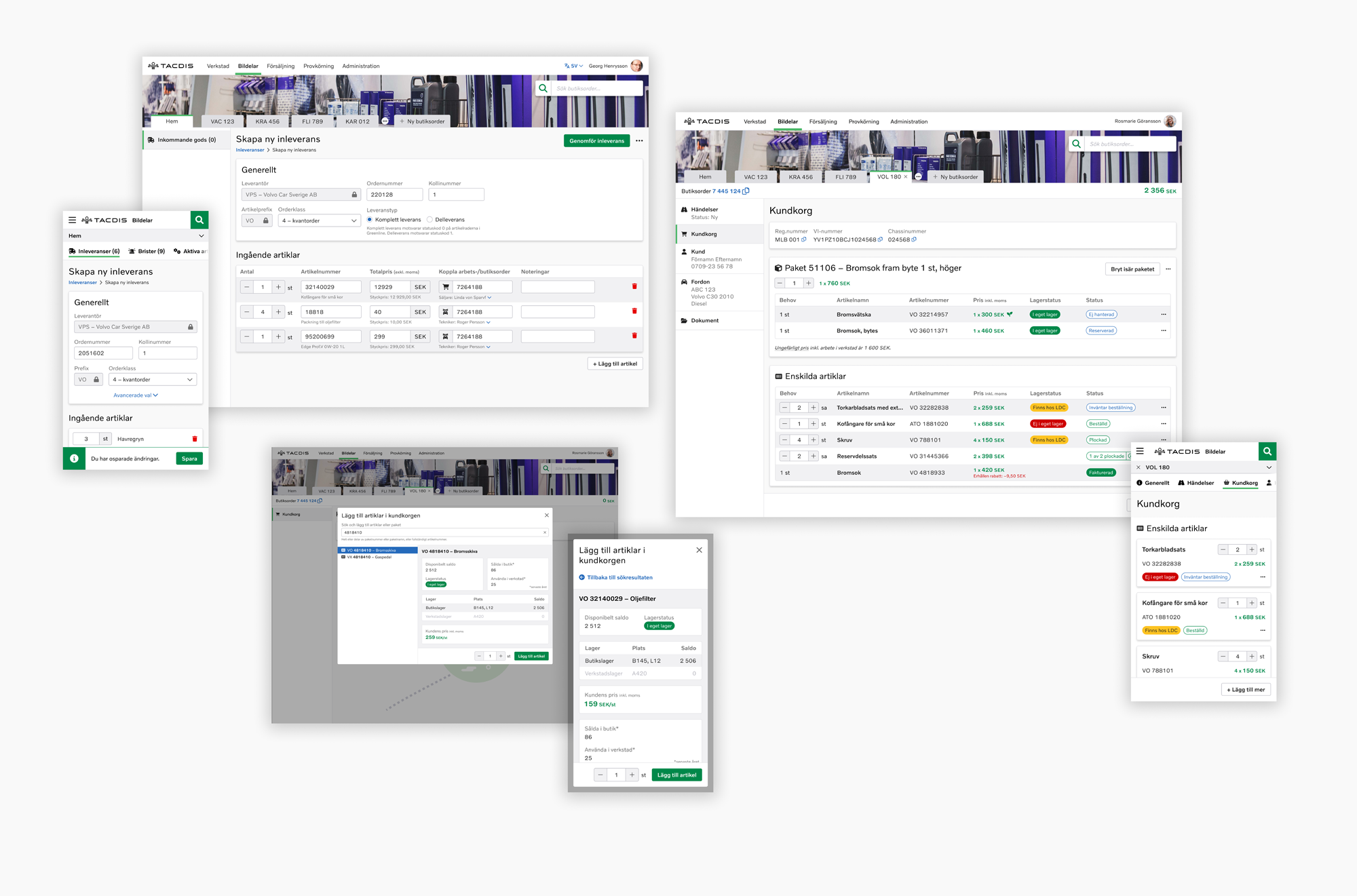
TACDIS DMS Parts – a business tool for Volvo retailers
Leading the full UX process when building a new work tool, with very rich and complex business logic, for all Volvo Cars retailers in Sweden, Norway and Japan. I have been involved since day one, with loads of research and UI design. The product is called TACDIS DMS Parts ('DMS' is short for 'Dealer Management System'), and the company I work for is Volvo Car Retail Solutions.
Background
I have been working for Volvo Car Retail Solutions, a company building complex SaaS (Service as a Software) products for the Volvo retailers in Sweden, Norway and Japan, for over six years. During this time, I have worked on three different products as well as overarching design work for the company, including setting up a design system in Figma and giving presentations about UX in general and research I have done.
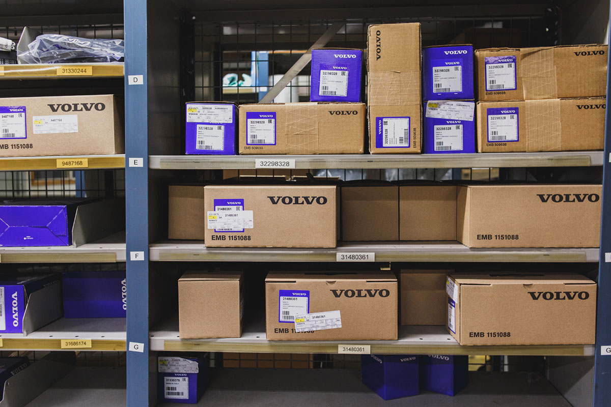
On this page, I have decided to focus on the largest project I have been working on: a web-based application (as a PWA, with mobile-first approach) for the car parts staff, replacing a very old desktop application from the late 90's. The users in the target group work with everything parts related, such as warehouse maintenance, ordering parts for the workshop, selling parts and accessories directly to customers in the shop, stock taking, goods reception, handling returns, administering part details and prices and much more. All these activities require software support, and that is what I have been working on.
The challenge of replacing
Our car parts users have in many cases been working in the same role for many years. The legacy computer system, released in 1998 and with thousands of functions, has been used daily since, without any major changes. Even though the interaction design of the old system is absolutely terrible by today's standards (when I show other UX designers at Volvo the old application, the room is always filled with laughter – that is how bad it is), many users are so used to it that any changes may initially receive sceptic responses. Therefore, it is a balancing act between keeping what is 'good' in the legacy system, and creating a contemporary solution.
'I was sceptical to start with, but d*mn how well thought through and easy the new TACDIS is to work with!! Well done!!!'
Understanding the business
A work tool of this kind is more complex than most people can imagine. Apart from just a huge amount of features, there are laws and regulations regarding taxes, insurances, accounting and much more. At the same time, the business logic for each little feature is often overwhelming, and most often there are many different edge cases for every single feature. I cannot explain in words how much it is to keep track of at times.
What I believe is that you as a UX designer must have almost full understanding of the business logic when designing. Of course, real business analysts are great when it comes to digging deep into the logic, but to be able to create a terrific user interface for it, you as a UX designer need to understand everything as well. Therefore, I in some sense come quite close to being a business analyst too.
'You are almost a business analyst at the same time!'
Research since day 1
I have been very privileged to do something I believe many UX designers just dream about doing: proper UX research without any stress. And I must say, that is how it should be done. The project of replacing the legacy system was initiated when my team, responsible for the parts domain, was formed in April 2021. From that day, I could do extensive research for half a year before the developers stated coding (and of course continuously ever since).
In this section, I summarise some of the methods I have been using over the years:
- Semi-structured interviews
- I, as well as most people in the team, was new to the parts domain when the project started. I started out with contacting parts staff all around Sweden and Norway, and held numerous interviews to get an understanding of their daily work. Of course, I needed a broad perspective, so interviews were held with all kinds of users, from parts managers to sales persons and warehouse personnel. Interviews have probably been the most recurring method during the whole project.
- Questionnaires
- Sending out questionnaires, mainly for quantitative data, is also a common method I have used many times. When initiating the project, my first questionnaire focused on the persons working with parts. Who are they, what background and passions do they have, and what are their views on the future of their profession?
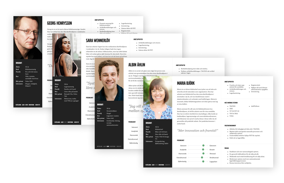
- Personas
- With the help of responses from the first interviews and questionnaire, I created personas. I personally believe that personas are not very helpful when you as a UX designer have good access to real users and visit a wide variety of users often, but they may help other people within the organisation to better understand the target group. I have mainly used the personas in presentations with colleagues.
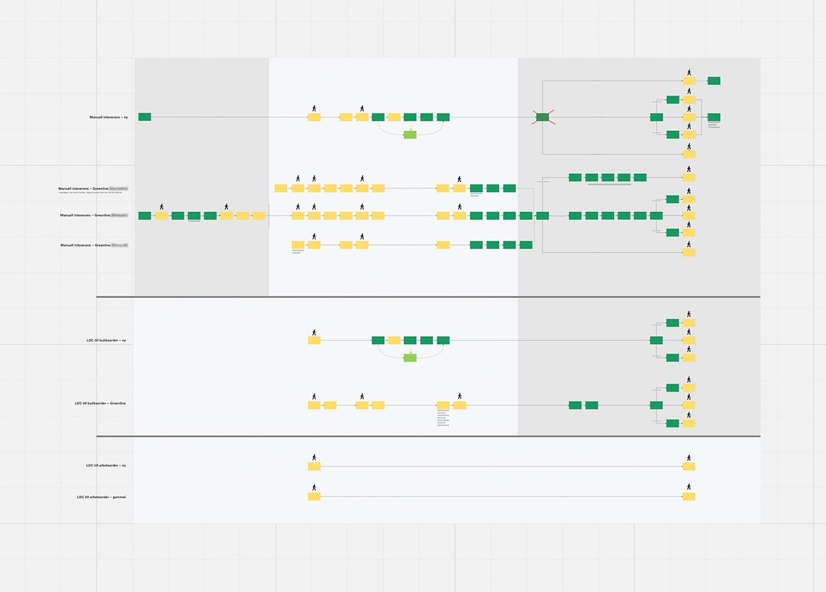
- User flow mapping
- Understanding the present is key to develop the future. With the help of interviews, I created a large user flow map of every activity the user may work with during an ordinary day. This made it possible to better see where we could improve the user flow by creating better software support. I did this in close collaboration with about 7 real users, who got to verify that I got the map right. Since then, I have almost always started with creating a very detailed user flow map for every single topic I work with.
- Affinity diagramming
- Of course a classic for all UX designers. For instance, I used this to group and analyse responses from a questionnaire with the question 'What differences would you like to see within your area in 10 years?'. I got loads of excellent topics of improvements from that.
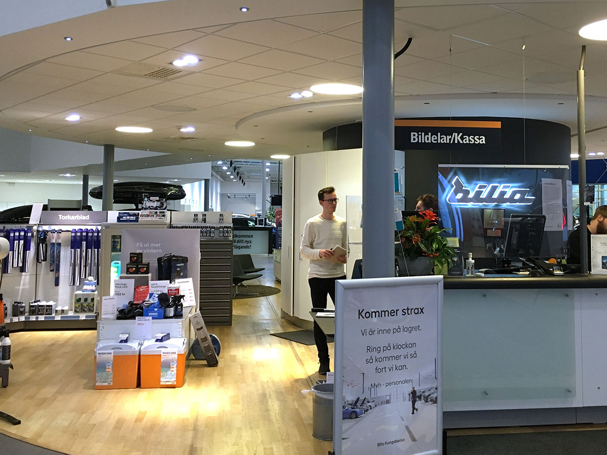
- Observations
- When I start working with a new feature or area, visiting several real users at different retailers is highly important. There, I observe them in their tasks, ask questions, take photos and notes. The material later works as input to other methods.
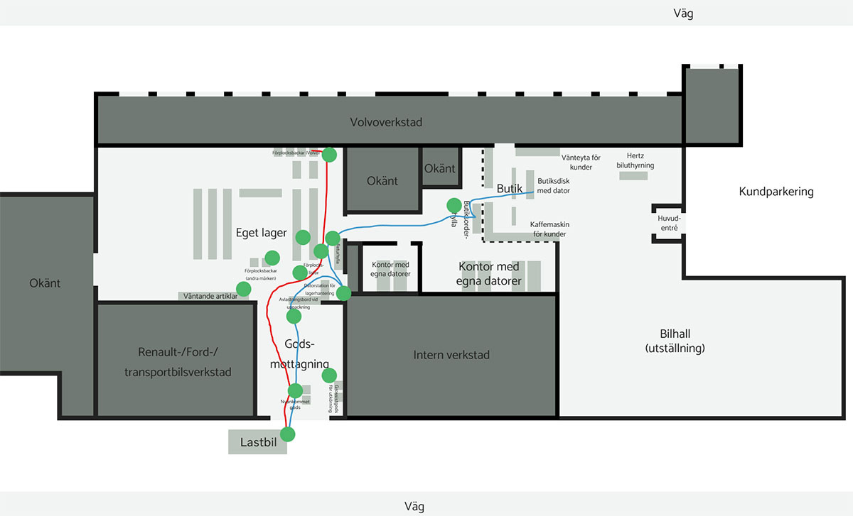
- Virtual tour
- After having visited some retailers, I have drawn digital maps of their facilities and marked out important locations for the parts personnel. I have then drawn lines showing how the users move around in different scenarios. Each location is also clickable, so colleagues can check out different locations to read about and see photos. This was in the beginning a great way to show how much movement there was only to go to stationary computers all the time to access the legacy software. A great selling point for making our application mobile.
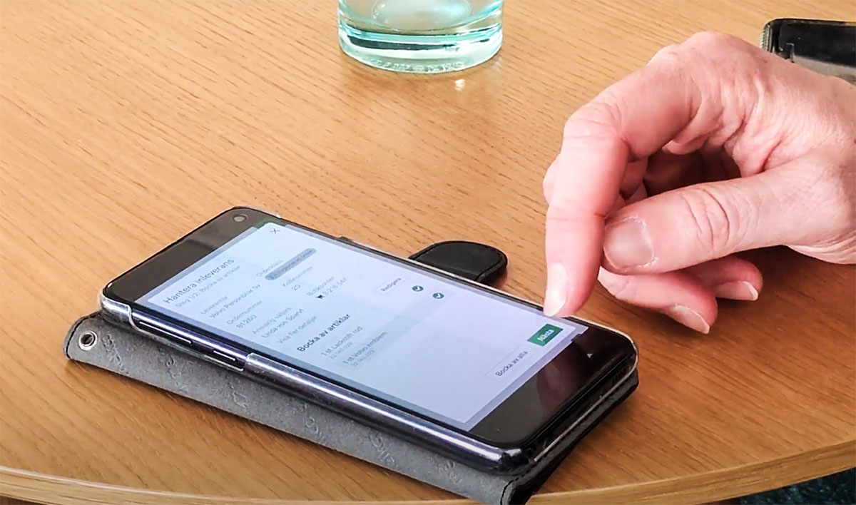
- Usability testing
- Since I have such a good access to real users, I can very easily test my UI prototypes. That is something I do for every feature I work on.
- Hotjar
- Now when our application is live, Hotjar is a great tool to anonymously record real user sessions, and gathering feedback. Hotjar is my biggest friend. Several times I have spotted bugs and other strange behaviours just because of Hotjar.
That was a short summary of selected research related things I have done, but of course there is much more.
'I'm soo grateful for all the great work you are doing with visiting our dealers to find out how they work and use our tools today. And also summarize and explain your findings in such an easy and smart way.'
Close relationship with users
I believe that you cannot create the perfect experience without knowing your users deeply. In this case, with such a complex system with loads of features, it is absolutely crucial. When I hear about a company that does not allow their UX designers to talk to real users, that is a big warning sign. Volvo Car Retail Solutions is the opposite of that.
I usually visit real users, or have video calls with users, several times for every single topic I work on. That is often more or less weekly, a bit depending on the needs at the moment. Visiting users is not only positive from my perspective as a UX designer, but also to give the users a sense of trust, and make them feel that they are seen. I don't think I have ever been rejected by a user, instead, they are happy to be visited and wish that I come back soon. Being involved in the development is something they often think is fun.
'It is fun to try it out a little and help creating a good product. The app is insanely easy to use!'
My everyday work
The team I work in consists of 9 people: 1 product manager, 1 team coach, 4 developers, 2 product specialists/business analysts and me as the only UX designer. I however have very close collaboration with the UX designer in a closely related team that focuses on the workshop personnel (I was previously a member of that team too), so we are almost always assisting eachother both when it comes to research and to UI design. I believe that the end result always gets better when you have someone to bounce ideas off, and it is much easier to conduct interviews and observations when you are two.
We follow the kanban framework within the team, with fractions of scrum incorporated. We previously used scrum, but we all now believe that kanban works better. It gives you a more even flow, and no need for full planning days and such (which I think all UX designers I have ever met think is boring).
I as a UX designer usually work ahead of the developers, doing research and preparing prototypes/mockups for them to follow. I don't like talking about 'hand-offs'; I prefer seeing the whole process as a collaboration. I may need a developer sometimes when I do my investigations, and I like being a helping hand during the development. I sometimes even end up writing some CSS, which some developers not always find too enjoyable. The best results are always achieved when I and the developer has continuous video calls to talk about small details.
This is usually my process when working on a new feature or area:
- 1. Defining scope
- Deciding what to focus on next. What feature should I look into? This is not entirely my own decision, but I usually am the leading figure when deciding. Most often, the decision is taken based on my previous research of what would be mostly valuable.
- 2. Visting several users
- The largest UX research phase, including what you read about in a section higher up on this page. Observing users, learn about their processes related to the feature, taking photos of key elements and locations, as well as interviewing.
- 3. Analyse results
- Often trying to answer the questions 'In what order do things happen and why?' and 'Where can we make their flow easier?', based on the research. Often I might need to go back to some users again when my understanding has become deeper. During this stage, Miro is my primary tool.
- 4. Create mockups/prototypes
- I create mockups and prototypes for a solution. Sometimes I start with a workshop together with the full team to get everyone involved. That is often appreciated amongst the others. The mockups/prototypes are created in Figma, but I have previous experience working in Adobe XD.
- 5. Usability testing with prototypes
- Again visiting real users to let them test prototypes. Often, some details have to be tweaked.
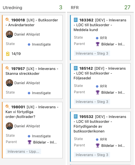
- 6. Help and feed developers
- Time for development to begin. I have prepared tasks on the kanban board with a little background story and a 'to do' list that works as acceptance criteria. During the development, I am always reachable for questions and discussions if something is unclear to the developers or if they notice that something is 'impossible' to achieve. Quite often, I have to come up with quick solutions.
Of course, the process differs a bit from time to time, but that was approximately how I usually work. Afterwards, I evaluate what has been released, for instance with usability testing with real users. Then it is time to start it all over with the next topic.
'You have a skill to summarise complexity to make it easy and understandable for others.'
Maybe you would like to see more of my creations? Or maybe even contact me?